Adobe© Illustrator© Project
Retro tiedye labels
Create your own unique retro tie dye label.
Before you begin, spend some time designing your label. Plan your color palette selecting from bold contrasting colors popular in the 60’s and determine what size label you want. Choose a suitable font to pick up the retro flavor. I’ve chosen Arnold Boecklin Standard from the Adobe font library.
My example will show a front label for a home-brewed wine called ‘MadMan Wine’ and I’ll be working within a 3” x 3.5” space.

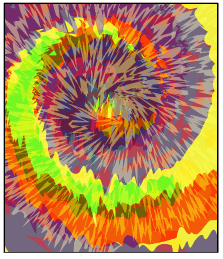
Part 1 Leave the mess behind and tie one on. Create your tiedye.
1. Start a new file in Illustrator and create a template background layer. Create a white filled rectangular shape the size of your label. Use a 3 or 4 point black stroke for easy visibility. In the layer palette, name the layer ‘template’ and lock it.
2. Begin with a spiral shape on a new layer. Adjust your sizes to suit your design. I selected the Spiral Tool with a 100 pt. radius, 75% decay, 10 segments. I then gave it a stroke of 30 pt. with Round Cap ends and deleted a portion of the center segments to open it up a bit. I also rotated and positioned the spiral to my liking.

3. Turn the spiral line into an outline shape with Object>Path>Outline Stroke. Copy and paste your spiral twice. Scale your copies and reposition them to suit yourself. I scaled my first copy 150% and the second one 175%; offset them from each other; and rotated them slightly. I also reversed the stroke and background colors just so I could see what I was doing.

4. Begin dyeing. Change each of the spiral fills to a color of your choice and remove the black stroke. Create a rectangle the same size as your template rectangle and fill it with a color of your choosing. Send that rectangle to the back to be your cloth background color.

5. Begin the tie wrinkles. In the toolbox select the Wrinkle tool and change your options. In the Wrinkle Tool Options dialog I chose 80 pt. width, 80 pt. height with 0° angle and left the other options as there default. I then started with the topmost spiral and started wrinkling the edges. I then hid that object from the layer palette and wrinkled the next spiral and so on.

6. Begin the bleeding process with Illustrator transparency. Make all your shapes visible again. Select each shape individually and start adjusting the transparency to suit yourself. This is one of the fun parts. Play around with the settings to suit yourself. The colors will react with each other. You may want to adjust their position and their base colors as you work. For this example you are seeing the top blue spiral with Normal and 60% opacity; the middle spiral is Multiply at 83% opacity; the bottom green spiral is Hardlight and 70% opacity. I also brightened up the cloth background to a more brilliant yellow after seeing the blends.

7. Customize further if you wish. I gave the three spirals a slight extra swirl with the Twirl Tool. You are seeing settings in the Twirl Tool Options Dialog for this example as 300 pt. width; 300 pt. height; 0° angle; 10% intensity; -97% twirl rate; 4 detail and .2 simplify. I also hit a couple of areas with the Crystallize Tool for a little extra oomph. You may want to save your file or otherwise track your changes so you can return to an earlier version if you’ve gone a little too wild and don’t want to hit the Undo key.

8. Add one or two top-most extra bleed-run shapes. In this example you’ll see I added a red star with Radius 1 at 5 pt.; Radius 2 at 200 pt.; and 15 points. I then chose Effect>Distort & Transform>Roughen. With the option dialog open and set to Preview, I set the size to 5 and the Absolute value at 10/in. I also hit the shape with the Pucker tool for a slight change. Lastly I adjust the opacity to Overlay at 57%.

9. Add the finishing touch with yet another bleed element. In this example we added a 5 point star in yellow with Radius 1 5pt and Radius 2 200 pt. Then I selected the Twirl Tool and twirled the star until it was a spiral. I then used the Roughen Effect with settings at 5 and Relative 30/.in. I played around with the transparency and settled on Color Dodge at 46%.

Part 2 - Add the text.
1. Enter and style the text. Lock the tiedye layer so you don't disturb it. On a new layer, I enter the label name. I used 48 pt. black to start in my prechosen Arnold Boecklin. What comes next is wide open and you’ll need to suit yourself. For this example you are seeing Shirofuchi 1 applied from Graphic>Style Libraries>Type Effects. This is generally the style I want. But from the Appearance palette I expanded the Fill options and deleted the Drop Shadow as I feel that isn’t really a 60’s design element. I double clicked the Offset Path and changed it to 2 pt. I then double clicked the color swatch and changed it to Va Va Va Voom Red.


Part 3 - Print, adhere and recycle your design.
1. Don’t worry about buying expensive sticky-back label paper. Any good quality laser print paper will do.
Pour out a bit of milk in a shallow plate. Cut your label to it’s finished size. Carefully dip the backside into the milk without saturating it. Then position it on your bottle or jar and gently smooth it out, creating a cost effective label that can be removed so you can reuse bottles for you next venture.
2. Keep a version of your tiedye as a base for creating new versions. Changing the original spiral colors and transparencies, and rotating and flipping the image can give you a very different look with little effort.
